Home | Previous | Next Lesson
Point & Figure Charts
Well, we always pride ourselves on bringing you some of the best articles on day trading but this is a special article. It is special because Point & Figure charting is really close to home as I have been drawing P&F chart by hand for some years.
This article by Stephen Archer is a great insight into the world of P&F charting and I think every serious trader should have at least some knowledge of how it works. Point & Figure Charts |
Why Point & Figure Charts?
Point & Figure (P&F) charts are one of the simplest and clearest ways to determining the best time to buy and sell shares. The P&F system represents one of the oldest approaches to share market trading. This method takes the technical analysts approach while monitoring supply and demand for each share. And the charts are designed for long-term trading so that the time and cost of trading shares is minimal
How are Point & Figure Charts Constructed?
In P&F charts both axis are dependent on price rather than one being based on price and the other on date. The key unit in a P&F chart is the point, or unit of price. The point size may change in value along the y-axis to provide consistent and relative price movements. This means that a if a share ranges between $8 and $12, the point size may be 10 cents when the share is below $10 and 20 cents when above. An ‘X’ is placed on the chart to indicate an upward movement and an ‘O’ indicates a downward movement. The graph gets its x-axis dimension via three point reversals. A three-point reversal occurs when either:
- The price is on a downward trend, then picks up three or more points, or
- The price is on an upward trend, then falls by three or more points.
Now, let's look at a typical example (Broken Hill). The point
size for these values is 20 cents.
| Date | Day | High ($) |
Low ($) |
| 10/02/98 | Tue | 15.38 |
15.00 |
| 11/02/98 | Wed | 15.22 |
14.95 |
| 12/02/98 | Thu | 15.01 |
14.81 |
| 13/02/98 | Fri | 14.95 |
14.35 |
| 16/02/98 | Mon | 14.45 |
14.05 |
| 17/02/98 | Tue | 14.39 |
13.98 |
| 18/02/98 | Wed | 14.62 |
14.31 |
| 19/02/98 | Thu | 14.66 |
14.42 |
| 20/02/98 | Fri | 14.40 |
14.24 |
| 23/02/98 | Mon | 14.45 |
14.32 |
| 24/02/98 | Tue | 14.35 |
13.98 |
| 25/02/98 | Wed | 14.22 |
13.93 |
The data previous to this showed an upward trend and constituted a series of ‘X’s in the column. This column peaks at $15.38 on 10/02/98. The last ‘X’ is drawn in the $15.20 square because the share has not yet reached $15.40. This means that for a three point reversal to occur the price must drop by at least 60 cents, or three points. This happens on 13/02/98 with a low of $14.35. When this occurs the chart is moved to the next column and ‘O’s are placed in the $15.00, $14.80, $14.60 and $14.40 rows. An ‘O’ is not placed in the $14.20 row because the price has not yet reached $14.20. The price does, however, fall to $14.05 on 16/02/98 and another ‘O’ is place in the $14.20 row. The chart falls once again to $13.98 on 17/02/98. When this occurs yet another ‘O’ is added to the chart, this time in the $14.00 row. The very next day the chart rises to $14.62 and this constitutes a three-point reversal. The chart is moved to the next column and ‘X’s are placed in the $14.20, $14.40 and $14.60 rows. No more ‘X’s are added to this column because the share performs another three point reversal on the 25/02/98 and three ‘O’s are place in the appropriate points in the next column. The chart should now look like the this (first column of chart incomplete):
| $15.40 | ||||
| $15.20 | X | |||
| $15.20 | ||||
| $14.80 | ||||
| $14.60 | O | X | ||
| $14.40 | ||||
| $14.20 | X | |||
| $14.00 | O | O | ||
| $13.80 |
Dates are added to the chart by replacing an ‘X’
or an ‘O’ by the month number. When the year changes
it is written at the bottom of the chart. You will notice
that the year labels can be vary in position as the charts
movement is dependent on price and not on date. The suspension
of trading on particular shares is shown by a ‘?’
in the charts.
The Wyckoff Method
The Wyckoff method is a special type
of point & figure chart. It uses a single box reversal
instead of the more common three point reversal. It also varies
from the standard point & figure chart because it can
contain both X’s and O’s in the same column. This
will occur whenever there is only a single entry made in a
column. For example if we had a single X in a column followed
by 3 O’s, the O’s will be displayed in the same
column as the X. In a Wyckoff chart there must always be more
than one entry in a column.
Let's take an example. The box size for these values is $1.00.
Note that a Wyckoff chart can also use high and low data,
but for clarity we have selected closing price data only.
| Date | Day | Close |
| 10/02/98 | Tue | 55.00 |
| 11/02/98 | Wed | 57.00 |
| 12/02/98 | Thu | 56.00 |
| 13/02/98 | Fri | 57.00 |
| 16/02/98 | Mon | 58.00 |
| 17/02/98 | Tue | 59.00 |
| 18/02/98 | Wed | 56.00 |
| 19/02/98 | Thu | 57.00 |
| 20/02/98 | Fri | 56.00 |
| 23/02/98 | Mon | 57.00 |
| 24/02/98 | Tue | 56.00 |
On 11/02/98 the chart rose from $55 to $57. This resulted
in 3 X’s being plotted in the first column. The very
next day there was a pull back of one box to $56. Because
we are using a one point reversal, we move to the next column
and plot the single O. The next day the price rises again
to $57. This again is a reversal, however we do not move to
the next column because we have only made one entry in the
current column. The upward movement continues until the chart
reaches $59 on 17/02/98. Continuing to plot the data in this
fashion will produce the chart below:
| $60.00 | |||||
| $59.00 | X | ||||
| $58.00 | X | O | |||
| $57.00 | X | X | O | X | X |
| $56.00 | X | O | O | O | O |
| $55.00 | X |
Other than the two requirements described above, the Wyckoff
point & figure chart uses the same principals as a standard
three point reversal chart.
When to Buy and Sell
When analysing the charts to determine the best time to buy and sell shares, the following criteria must be evaluated:
- Patterns
- Trend Lines
- Market Indicators
- Price Objectives
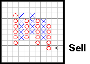
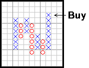
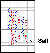
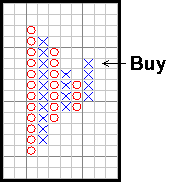
Point & Figure Patterns
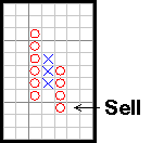
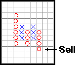
Double Top and Double Bottom Formation
|
 |
Double Top |
Double Bottom |
Double Top and Double Bottom formations are the most basic of chart patterns. A Double Top is formed when a high is followed by a decline, which is then followed by a rise that exceeds the previous. A Double Bottom is formed in a similar fashion. As we will see later, most other formations are variations on this simple pattern. Generally, formations that consist of more than 3 vertical columns yield better results.
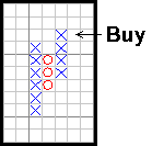
The Triple Top and Triple
Bottom Formation
|
 |
Triple Top |
Triple Bottom |
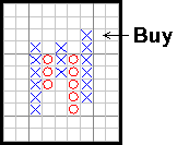
This pattern occurs when a series of 2 or more tops or bottoms is penetrated. Generally this is formed by 5 vertical columns, however it is possible for formation to be spread over multiple columns as shown below:
|
 |
Spread Triple Top |
Spread Triple Bottom |
Bullish and Bearish Triangle Formations
|
 |
Bullish Triangle |
Bearish Triangle |
Both triangle formations consist of higher bottoms and lower tops, generally with all prices contained between the bullish support and bearish resistance lines. The signals for the triangle formations are the first Double Top or Double Bottom signals.
The Bullish and Bearish Signal Formation
|
 |
Bullish Signal |
Bearish Signal |
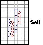
The significant feature of a bullish signal formation is a higher bottom followed by a higher top. This often indicates that demand has overcome supply. Consequently a lower top followed by a lower bottom forms a bearish signal formation. This often indicates that supply has overcome demand.
Bullish and Bearish Catapult Formations
|
 |
Bullish Catapult |
Bearish Catapult |
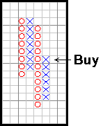
A Bullish Catapult Formation consists of a Triple Top Buy Signal, a pullback that produces no bearish signal, followed by a new double top buy. This formation has three distinct buy points: (i) the Triple Top Buy Signal, (ii) the bottom of the pullback (with a stop a bearish signal – if it should occur), (iii) the Double Top Buy Signal. A Bearish Catapult Formation is the reverse situation.
Long Tail Down
Long Tail Down
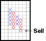
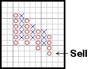
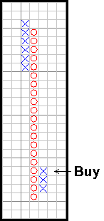
A Long Tail Down must have at least twenty Os down. A buy signal is given whenever there is a 3 box upside reversal. A stop-loss can be placed where a double bottom sell signal may occur.
High and Low Pole Formations
|
 |
High Pole |
Low Pole |
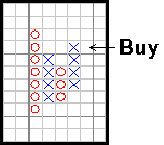
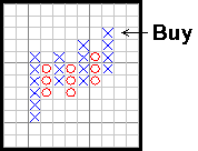
A High Pole begins with at least 3 Xs above a previous top. The formation is completed when there is a reversing column of Os that is at least 50% as long as the column of Xs. This warns of a topping process. The Low Pole is the reverse situation.
For more information on Point & Figure patterns see Point & Figure ReferencesReferences.
Trend Lines
The next important issue is whether or not the buy and sell signals are in agreement with the basic trend of the stock. This can be assessed via trend lines. Trend lines can be drawn in Bull’s-Eye Broker by clicking on the starting point and dragging the mouse to the desired end point.
The Bullish Support Line
A bullish support line is drawn from the lowest point on completion of a significant downtrend and is extended up at a 45-degree angle as far right as possible. This line is predictive because it can be drawn as soon as the market has completed its downtrend. This line does not connect points as trend lines often do. An example of a Bullish Support Line is shown below:
Having drawn this, the theory is quite simple. Any sell signals given above this line should be disregarded. This means the share should not be sold until the first sell signal after the bullish support line has been penetrated.
The Bearish Resistance Line
The bearish resistance line is a very similar concept to the bullish support line. It is drawn from the highest point on completion of a significant uptrend and is extended downwards at an angle of 45 degrees as far right as possible. An example of a bearish resistance line is shown below:
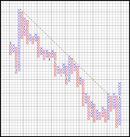
Any buy signals given below this line should be disregarded. This means the share should not be purchased until the first buy signal given after penetration of the bearish resistance line.
Market Indicators
Before buying and selling shares, it is necessary to assess 2 market indicators:
- The industry group to which the share is associated. The Australian Stock Exchange supplies index figures on about 45 different groups.
- The market as a whole. This should be assessed via inspection of the All Ordinaries, All Industrials, All Resources charts as well as overseas indices like the Dow Jones.
Shares should only be purchased when the market as a whole is bullish. Similarly, shares must be selected from industry groups that are bullish and acting better than the rest of the market.
Price Objectives
There are two ways to project price: vertical and horizontal
counts.
Vertical Count
Buy – Assuming a 3-box reversal, count the number of
Xs in the first move up that produces a buy signal. Multiply
this number by 3 and add the product to the lowest X in the
column on the right. Sell – Reverse for a sell signal.
Bullish Vertical Count
| $40.00 | ||||
| $39.00 | X | |||
| $38.00 | X | X | ||
| $37.00 | O | X | O | X |
| $36.00 | O | X | O | X |
| $35.00 | O | X | O | X |
| $34.00 | O | O |
5 X's up
3 * 5 = 15 and 35 + 15 = 50
50 is the upside objective
Bearish Vertical Count
| $55.00 | |||
| $54.00 | O | ||
| $53.00 | O | X | |
| $52.00 | O | X | O |
| $51.00 | O | X | O |
| $50.00 | O | O | |
| $49.00 | O |
4 O's down
4 * 3 = 12 and 52 – 12 = 40
40 is the downside objective
Horizontal Count
Buy – Assuming a 3-box reversal, count the number of boxes across the base of the formation that has given a buy signal. Multiply that number by 3 and add it to the price associated with the lowest X. Sell – Reverse for a sell signal.
Bullish Horizontal Count
| $40.00 | ||||
| $39.00 | X | |||
| $38.00 | X | X | ||
| $37.00 | O | X | O | X |
| $36.00 | O | X | O | X |
| $35.00 | O | O |
4 boxes across
3 * 4 = 12 and 35 + 12 = 47
47 is the upside objective
Bearish Horizontal Count
| $55.00 | |||
| $54.00 | O | ||
| $53.00 | O | X | |
| $52.00 | O | X | O |
| $51.00 | O | X | O |
| $50.00 | O | O | |
| $49.00 | O |
3 boxes across
3 * 3 = 9 and 52 – 9 = 43
43 is the downside objective
For more information on Price Objectives see References.
Guidelines
Below are some useful guidelines to consider when buying stocks (reverse for selling stocks):
- Buy stocks when the percentage of bullish stocks has a column of Xs, especially on an upturn from below 10%.
- Buy stocks whose sector relative strength chart has a column of Xs.
- Buy stocks whose relative strength chart has a column of Xs.
- Buy stocks that are above their Bullish Support and Bearish Resistance Lines.
- Buy stocks that have some kind of bullish signal.
- Consider buying some stocks that are in a pullback, but whose relative strength has a column of Xs.
- Look to take profits whenever the percentage of bullish stocks is above 70% (and especially above 80%) and have a column of Os.
- Rising bottoms are stronger than flat bottoms.
- Based on a research study, the strength of bullish signals in order are: Triple Top, Spread Triple Top, Bullish Signal, Double Top
To find our more about P&F charting and receive a free trial on Stephens software: go to www.archeranalysis.com
Point & Figure Charts
by Stephen Archer
www.archeranalysis.com
Good Trading
Best Regards
Mark McRae
Information, charts or examples contained in this lesson are for illustration and educational purposes only. It should not be considered as advice or a recommendation to buy or sell any security or financial instrument. We do not and cannot offer investment advice. For further information please read our disclaimer.
![]() To PRINT or save a copy of this lesson in PDF format simply click the PRINT link. This will open the lesson in a PDF format which, you can then PRINT. If you are unfamiliar with PDF or don't have a FREE copy of Arobat Reader see instructions.
To PRINT or save a copy of this lesson in PDF format simply click the PRINT link. This will open the lesson in a PDF format which, you can then PRINT. If you are unfamiliar with PDF or don't have a FREE copy of Arobat Reader see instructions.